Tasty Taste
Shanghai is a city where you can get nearly any food at anytime thanks to the popular food delivery service. In our project, we collected the information of food delivery service from the "Eleme" app. We chose data from four typical districts in Shanghai, categorized them by flavors, and use different visualizations to illustrate our dataset.
full version of the datastory in pdf link
Different ideas for the topic
Settling down the topic was quite a challenge for our group. At first we logged onto the Shanghai Open Data Platform. There are a lot of accessible data, however, the five of our team members could not find a theme that we are all interested in. Then we checked for different sources of data, and developed four different ideas: Shanghai night snacks; popular dishes of hot pots; most popular milktea beverages; sweetness of Shanghai dishes. All of them were related to food, since we thought that food was a topic related to everybody’s daily life. However, choosing from the four topics was a huge pain. We have to consider about the accessibility of different data, and it seemed that none of them was easy to get access to. So we decided to split up the tasks, which meant that each of us took one topic and tried to get access to the source and see if we can get some data. We sent e-mails to Haidilao, a famous hotpot chain store in China, to see if we can get the data of their sales records. We also sent emails to Eleme, Meituan, and other food delivery platforms to ask if we could get the data of their food orders and delivery routes at night, so that we could get some ideas about who in Shanghai usually order food at late night and what do they eat. Replies came very quick, yet all of them were disappointing. It seems that all the data we asked were their “commercial secrets”, so they were not able to help us. At this step, we encountered the first obstacle of our project: It seemed that the data for the topic that we chose could not be reached. That leaves only one option for us: to change our topic, and to find reachable data that we are interested in. After some struggle, we decided to focus on the current situation of food delivery service. Instead of the food orders and delivery routes, we slightly altered our focus point to the quality and quantity of the whole food delivery service in Shanghai.
Specifying the topic
As we’ve decided to focus on the food delivery service, we listed several aspects that we consider to be relatively important for our topic: ² The quality of the shops’ environment ² The addresses of the shops ² The types of food the shops sell ² The sales number of each shop ² The rate of the shops given by the users ² The time of open hour of the shops Then our task changes into fetching data from websites. Our team member Shuhao used a crawler called Bazhuayu a software robot downloaded to automatically fetch data from Eleme’s websites. The input was the approximate location, and the output was the accessible information of each shop near this location. At the very beginning, we chose Yangpu District and other two districts near Yangpu, since this area is most familiar to us. Then Francesca suggested that we could also put Lujiazui into our dataset, which is the financial center of Shanghai. That area is very near Yangpu, just across the Huangpu River, adding it into our dataset might bring us more interesting patterns. So the four districts became our input. The original raw data was rather dirty. There were a few shops in Suzhou and other provinces included in the dataset, also, the addresses of the shops were written in different formats, which demanded challenge for us to organize and put them into order.
Processing and visualizing the data
Now we have such a large dataset. How to process the data and highlight the significant entries? How to categorize different data? This is another troublesome task. We discussed several ways to categorize the food. One is that we categorize the food by their appearing formats, like rice, dumplings, hotpots, noodles, fried things… But according to this standard, we have tons of categories which was difficult to visualize, not to mention discovering any trend. So we changed a way of thinking, and found that according to traditional Chinese pharmacology, there are five flavors: sweetness, sourness, bitterness, peppery hotness, and saltiness. This could be a possible way of categorizing our data.
more details into datastory pdf
Final Viz / Scatterplot
As we knew about the quality and quantity of our dataset, we thought that
we could do a map of the shops and see the scattering of our dataset. So we
reprocessed our dataset, we put the addresses of the shops into an online tool to
transform into latitude and longitude (http://www.gpsspg.com/latitude-and-longitude.htm),
then we have a new series of “code number” to visualize the exact locations of
each shop.
We used latitude and longitude as horizontal and vertical axis to make a map of the shops (You can even see the outline of the Huangpu River). The size
of the circles represents their sales number, the bigger the circle is, the more
orders that shop has sold in the last month. The colors represent the flavors (yellow:
salty, purple: sweet, red: spicy, green: bitter, blue: sour). From the map, we can
also tell that most food are scattered all over the places that we chose, but bigselling
bitter food (big green dots) only shows up in places near Lujiazui area
(including Huangpu District). With the knowledge from previous graphs, we
know that most bitter orders are from Lujiazui, so we could possibly assume that
most orders that the big-selling bitter food shops in Huangpu District received are
from Lujiazui. They have to deliver food orders across the Huangpu River. Maybe
this phenomenon was because the rent was too expensive for the shops to open
right at Lujiazui area.
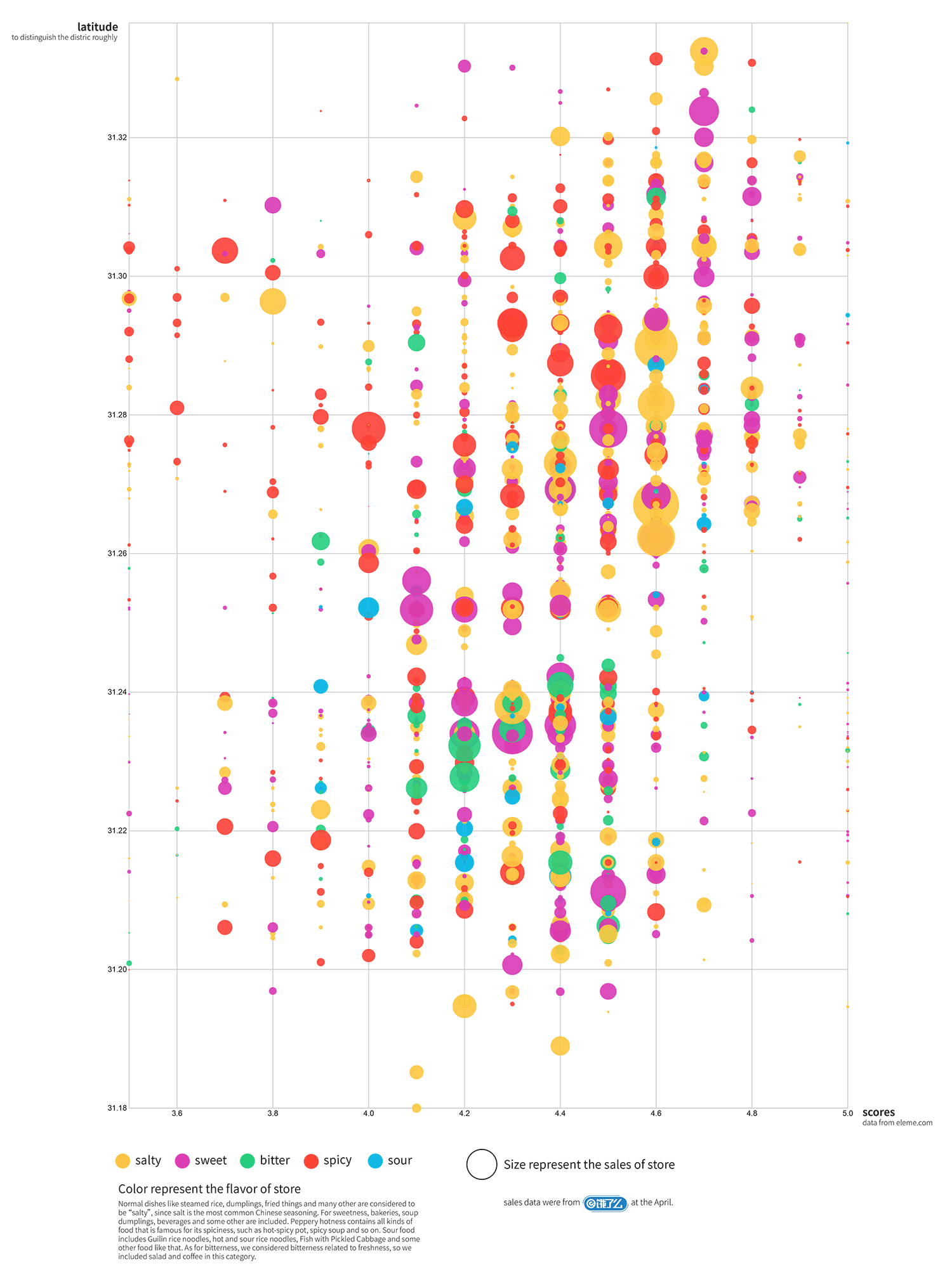
We also want to see the relationship between the flavors of the shops and
the rates they received, as well as the relationship between the location and the
rates. For the former purpose, we used longitude as the vertical axis and scores
and the horizontal axis, and then we have a rather scattered graph of shops sorted
by their rates. The colors of the circles show their flavors. On the other hand, for
the latter purpose, we changed the colors of the circles so that each color
represents a district.
From the graphs, we can see that the best-selling shops are mostly rated at
4.3-4.7, and shops in Yangpu District are higher rated. Also, two shops in Yangpu are rated low (at 3.7 and 3.8), but they still have rather big sales numbers. One
sells spicy food and the other sells salty food.
The full-score shops all have little sales number, this made us rather curious:
Are they newly-opened shops or do they just cope with a few orders a day to
ensure the quality of their food?
Full images of the graphs into the full datastory in pdf pp. 9-12
Entity shops investigation
The final part of our datastory includes field research to the shops that emerged from the visualizations. We went to visit four restaurants, 1) the best selling in food delivery, 2) two restaurant with low ranking but high sales, 3) a very low-ranked restaurant. Details of these explorations are included in the datastory at pages 12 to 16.
Final Reflections
The whole process from collecting to visualizing data and then the investigation was interesting as well as challenging to every one of our group members. We don’t have any technical background, before this class, we know little about this area. Following Francesca’s classes, we began to get some ideas about how to fetch data and how to use tools to visualize our data. The most challenging part for our group is to decide which part of our dataset we really want to visualize. As we have fetched a lot of information about different food shops, it became hard for us to abandon some of the information. This process is called “数据降围” in Chinese. The categorizing was challenging, too. We had to decide which method was the most scientific one. And we went through some articles 1 | 2 | 3. According to these categorizations and our own knowledge, we went through our dataset and categorized our data manually. This was rather challenging for us, and we wonder if there could be a better way to categorize the flavors. The final outcome of our project was higher than our expectation. We were amazed that data could be this beautiful. Some of the visualizations really gave us a surprise. At first we were only interested in the type of food that people in different district preferred, but the results showed a lot more. With our visualization and dataset, it became much clearer that which food shop offered good and popular food. When people want to order food from Eleme, they can refer to our data visualization and make the right choices. Thanks to Francesca, we also met some people who are really passionate in this field, which encouraged all of us a lot.
Please check below our final visualizations in poster format

Project by Ma Shuhao | Cai Zhelin | Tai Lunyue | Wu Tong | Yang Lixing
back to top