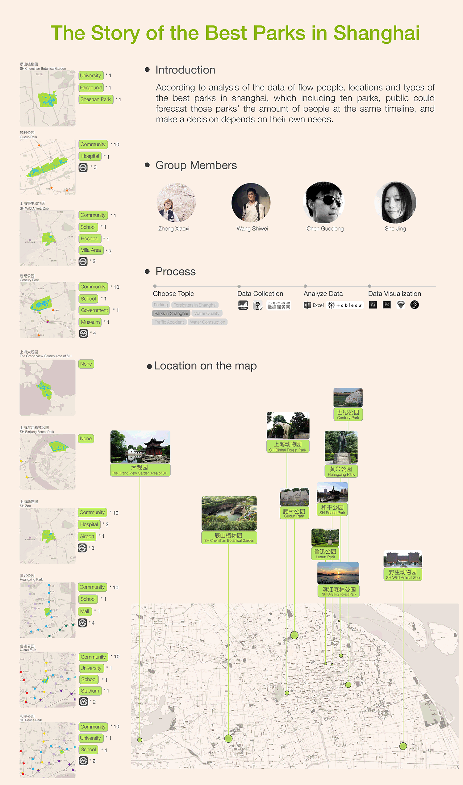
The Story of the Best Parks in Shanghai
full version of the datastory in pdf link
According to analysis of the data of flow people, locations and types of the best parks in shanghai, which including ten parks, public could forecast those parks’ the amount of people at the same timeline, and make a decision depends on their own needs.
Choosing the topic
At the very beginning, we did a lot of research on the website of Shanghai data to collect data. Then the dataset of “Park in Shanghai” captured our attention. In this data set we can find the total area, the location, the green space and the water area of those parks in Shanghai. We can use these data to give some suggestion to people who want to visit parks in Shanghai.
Data collection
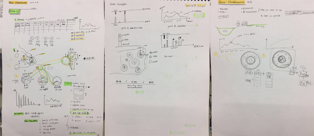
We thought that these data were not enough. Chen Guodong recommended a WeChat Subscription named Shanghai Fabu which can provide the data of people flow in many tourist attractions in Shanghai. And most of the parks we found are in the subscription. So we intended to find if there are some relationships between the people flow and the features of each parks. The subscription only offers the current people flow without any historical records, so in order to get more data we decided to record the data of people flow every hour. We showed the data in subscription to Francesca, she suggested us to figure out if it is the current number of people in the park or the current number of people enter the park. During our collecting proceed, we found that there still many people in parks at closing time. So we concluded that those data of people flow are the current number of people in parks. The process of collecting data seems easy but requires us to check the WeChat subscription per hour. It needs both patience and passion. We choose 12 parks’ data of people flow to build our dataset. And each teammate recorded 4 parks’ data every day. The problem was that we found 2 parks’ data were not updated every day. In order to solve this problem We tried to call the manager of Shanghai fabu platform. But the manager told us to dial 5257788 which is the number of Shanghai Greening Bureau to find the answer. The Greening Bureau asked us to call 5158693 which is the number of Park Greening Bureau, yet we didn’t get any solid answer from them. So we delete 2 parks without full data and choose 10 parks’ data to develop our visualization. We eventually collect 13 days of data including 8 workdays, 2 weekends and 3 days in May Day Holiday.
Analyze data by using different tools

Develop data visualization
We had a clear division of work. Wang Shiwei organized all the dataset and find some related
examples of charts. Zheng Xiaoxi worked on Al and RAW to produce some basic charts. Chen
Guidong tried to locate every park in the map of Shanghai. And She Jing used Processing to
generate a scatter diagram to show the people flow of each park in different time.
PART 1 Scatter Chart
In this part we want to show the people flow of each park in different times. X axis represented
parks, and Y axis represented time, the area of each circle represented the people flow per hour
in each parks.
We can also compare the data in weekend, workdays and holidays in this diagram through 3
concentric circle with different color. Francesca suggested us to use different color in these 3
concentric circle in order to show the difference between weekend, workdays and holidays.
After finishing our basic scatter charts, we found that the gap between 3 concentric circles is
huge. We soon realized that we made a mistake about the radius, we defined the data of people
flow as the radius itself, but She Jing and Wang Shiwei said that we should define the people
flow as the area of circle, and use the formulas “S=π×r2” to calculate the radius and generate a
new scatter chart. Now the chart is more clear and accurate.
more charts at pp. 6-8 of the datastory in pdf
Following are the major formulation and their corresponding code we develop during the coding
process.
import processing.pdf.*;
size(2360, 2360, PDF, "test.pdf");
background(255);
strokeWeight(1);
stroke(#cbbca6);
noFill();
for (int a = 200; a < 2360; a += 200){
line(a+200, 0, a+200, 2360);
}
//1. The number of Chenshan
fill(29, 32, 136, 99);
noStroke();
ellipse(400, 2180, r, r); //draw a circul in the first line, represent the people in the park currently at
Working day 8:00.
PART 2 Bar Chart
The purpose of this part is to help people choose the suitable park, the colorful bar charts show
the composition of park and beneath the colorful bar is the grey bar chart which shows the
distance from People’s Square to each parks, because People’s Square can be considered as
the center of Shanghai. And tourists and residents can choose to go to the park they like.
We used this colorful stacked bar charts to illustrate the composition of park in figure 5, each bar
contains 3 parts. The green part represents the green space in the park, the blue part represents
the area of rivers and lakes in the park, and the grey part represents other functions of the park,
such as children facilities, BBQ sites and so on.
We sorted every park by size, the first bar on the left is the largest park while the last one is the
smallest. Then combined with scatter chart in part 1 we can conclude that the biggest park is not
the most popular park. And maybe there are some relations between the distance and the
people flow.
more charts at pp. 8 of the datastory in pdf
PART 3 Line Chart
For the purpose of showing the people flow trend of one park in different days. We selected 3
typical parks including the most crowded park(Shanghai Wild Animal Park) , the smallest
park(Shanghai Heping Park) and the farthest park(the Grand View Garden Area of Shanghai) to generate 3 line charts. The chart of SH Wild Animal Park shows that the number of people in
holidays is larger than weekends and workdays. And there is a peak of people flow between
11pm and 13 pm. While in the chart of the Grand View Garden Area of Shanghai, there are 2
peaks in one day, the first peak is at 10am, and the second peak is at 2pm. The SH Heping Park
which can be considered as a weekend park because the largest number of tourists appeared in
weekends instead of holidays like the other parks.
more charts at pp. 10-12 of the datastory in pdf
PART 4 Maps
In order to show the outline of every park and have a better understanding of the surroundings of
each park, we located all the parks we chose on the map of Shanghai, and gave an image of
details to show more information like how many metro stations are around each park. Through
this we can find if there are some relations between the traffic and the people flow. And we also
located some infrastructures like residential areas, schools, hospitals around those parks.
more charts at pp. 11 of the datastory in pdf
Conclusion
In this study, we find that the data quality provided by the government website is not so good. For example, one of our teammates went to the Shiji Park and find that the park is very crowded without any parking space, while the number of person on the website is small. So some parts of the data may not be accurate. And most of the parks’ managers are unwilling to share the data with us. However, we finally got most of the data we need through different ways, and this is an exciting process. If we can get more data, we can predict the people flow in different time and give suggestions to tourists and residents who want to choose and visit some special parks. In that way we can divide people into different places so that they can have a better experience visiting the parks.
Please check below our final visualizations in poster format
Project by She Jing | Wang Shiwei | Zheng Xiaoxi | Chen Guodong
back to top